Components / Animated Image
Animated Image
A clipped, grayscale image that animates to full-color and full-rectangle on hover. Perfect for adding subtle motion to avatars, covers, or feature images.
Installation
Install the component using the shadcn CLI:
npx shadcn@latest add ChinmayNoob/fern-ui/animated-imagePreview
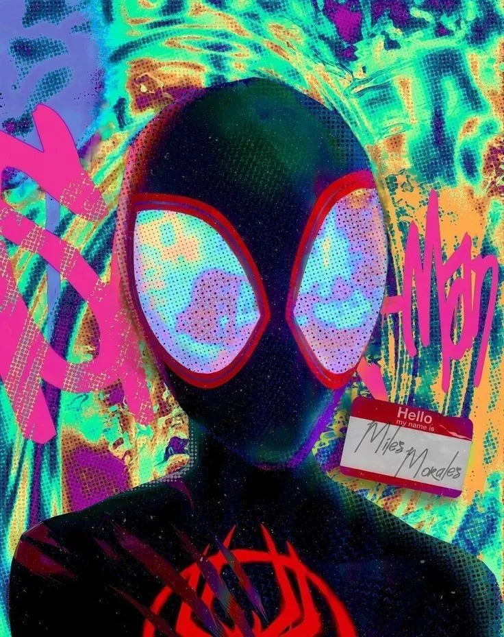
Hover over the diamond-shaped image to see it expand and reveal full color.
Usage
tsx
import AnimatedImage from "@/components/animated-image/animated-image"

export function Example() {
  return (
    <AnimatedImage
      src="/agents/spiderman.webp"
      alt="Animated image"
      size={320}
      duration={500}
    />
  )
}
Props
| Prop | Type | Default | Description |
|---|---|---|---|
| src | string | required | Image source URL |
| alt | string | "Animated Image" | Accessible alt text for the image |
| size | number | 400 | Width and height of the image in pixels |
| duration | number | 500 | Transition duration in milliseconds |
Notes
- Uses CSS
clip-pathto switch between diamond and rectangle shapes. - Grayscale and scale animations are controlled via Tailwind utility classes.
- Mouse-only interaction; on touch devices the static state will be shown.
Source Code
tsx
'use client'
import React from "react"

export interface AnimatedImageProps {
    src: string
    alt?: string
    size?: number
    duration?: number
}

const AnimatedImage = ({
    src,
    alt = "Animated Image",
    size = 400,
    duration = 500
}: AnimatedImageProps) => {
    return (
        <div className="overflow-hidden">
            <img
                src={src}
                alt={alt}
                className="w-full h-full rounded-xl object-cover grayscale scale-100 transition-all hover:grayscale-0 hover:scale-95"
                style={{
                    clipPath: "polygon(50% 0%, 100% 50%, 50% 100%, 0% 50%)",
                    width: size + "px",
                    height: size + "px",
                    transitionDuration: duration + "ms",
                }}
                onMouseEnter={(e) => {
                    e.currentTarget.style.clipPath =
                        "polygon(0% 0%, 100% 0%, 100% 100%, 0% 100%)"
                }}
                onMouseLeave={(e) => {
                    e.currentTarget.style.clipPath =
                        "polygon(50% 0%, 100% 50%, 50% 100%, 0% 50%)"
                }}
            />
        </div>
    )
}

export default AnimatedImage