Components / Hover Gallery
Hover Gallery
An interactive image gallery with smooth layout animations. Images are stacked by default and expand into a 2x2 grid on hover with beautiful transitions.
Installation
Install the component using the shadcn CLI:
npx shadcn@latest add ChinmayNoob/fern-ui/hover-galleryPreview
Hover over the gallery to see the images expand into a grid layout.

Usage
tsx
import HoverGallery from "@/components/hover-gallery/hover-gallery"

// First 3 images for the stacked view
const stackedImages = [
  { id: 1, bg: "#22c55e", img: "/images/photo1.jpg" },
  { id: 2, bg: "#ef4444", img: "/images/photo2.jpg" },
  { id: 3, bg: "#eab308", img: "/images/photo3.jpg" },
]

// 4th image for the bottom
const bottomImage = { id: 4, bg: "#3b82f6", img: "/images/photo4.jpg" }

export function Example() {
  return (
    <HoverGallery
      stackedImages={stackedImages}
      bottomImage={bottomImage}
      width="420px"
      height="450px"
    />
  )
}
Props
| Prop | Type | Default | Description |
|---|---|---|---|
| stackedImages | Element[] | defaultStackedImages | First 3 images for stacked view |
| bottomImage | Element | defaultBottomImage | 4th image shown at bottom |
| width | string | "420px" | Container width (CSS value) |
| height | string | "450px" | Container height (CSS value) |
| className | string | - | Custom class for wrapper |
Element Type
| Property | Type | Description |
|---|---|---|
| id | number | Unique identifier for layout animations |
| bg | string | Background color (fallback) |
| img | string | Image source URL |
Features
- Smooth layout animations powered by Framer Motion
- Stacked card view with rotation effects (-12°, 0°, +12°)
- 2x2 grid expansion on hover
- Shared
layoutIdfor seamless transitions - Customizable container dimensions
- Theme-aware with card and border styling
- Background color fallback for images
Animation Logic
- Default state: 3 cards stacked with rotation + 1 at bottom
- On hover: Stacked view fades out (opacity 0)
- Grid view fades in with
layoutIdtransition - Cards animate from their stacked positions to grid positions
- Uses
AnimatePresencewith popLayout mode
Dependencies
bash
npm install motionSource Code
tsx
"use client";
import { cn } from "@/lib/utils";
import { AnimatePresence, motion } from "motion/react";
import { useState } from "react";
type Element = {
id: number;
bg: string;
img: string;
};
export interface HoverGalleryProps {
/** First 3 stacked images */
stackedImages?: Element[];
/** 4th bottom image */
bottomImage?: Element;
/** Container width */
width?: string;
/** Container height */
height?: string;
/** Custom class name */
className?: string;
}
const defaultStackedImages: Element[] = [
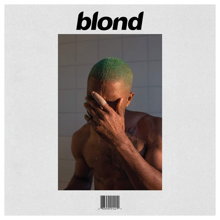
{ id: 1, bg: "#22c55e", img: "/albums/blonde.png" },
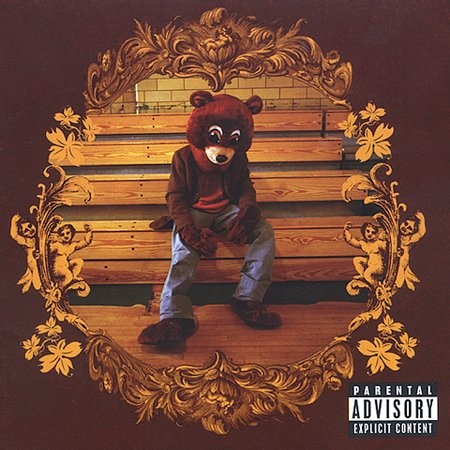
{ id: 2, bg: "#ef4444", img: "/images/college-dropout.jpg" },
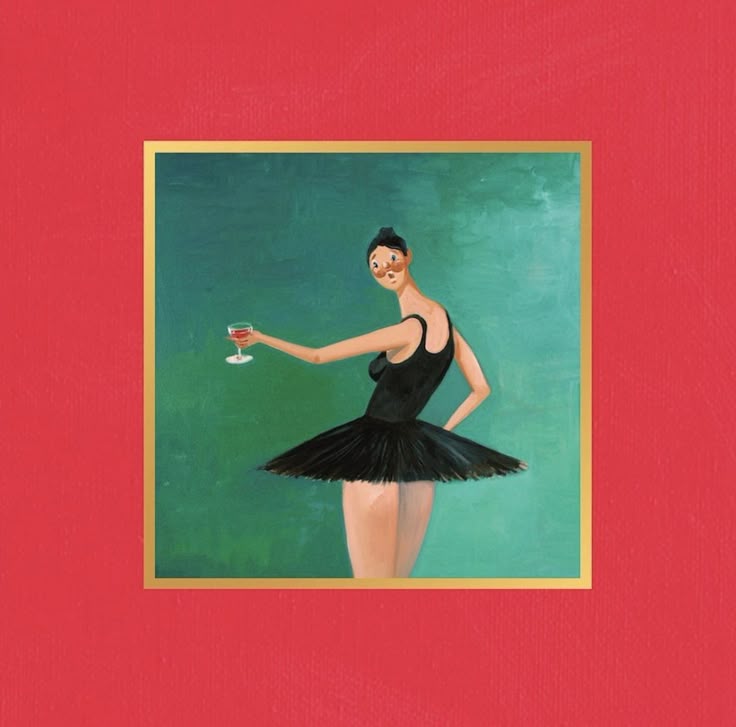
{ id: 3, bg: "#eab308", img: "/images/graduation.jpg" },
];
const defaultBottomImage: Element = { id: 4, bg: "#3b82f6", img: "/images/mbdtf.jpg" };
const Gallery = (props: { item: Element; index?: number }) => {
return (
<motion.div
className={cn(
"rounded-2xl flex items-center justify-center h-[80%] w-[80%] max-h-[222px] origin-bottom overflow-hidden"
)}
layoutId={`box-${props.item.id}`}
animate={{
rotate: props.index === 0 ? -12 : props.index === 2 ? 12 : undefined,
}}
style={{
gridRow: 1,
gridColumn: 1,
backgroundColor: props.item.bg,
}}
>
<img src={props.item.img} alt={`Gallery item ${props.item.id}`} className="w-full h-full object-cover" />
</motion.div>
);
};
const HoverGallery = ({
stackedImages = defaultStackedImages,
bottomImage = defaultBottomImage,
width = "420px",
height = "450px",
className,
}: HoverGalleryProps) => {
const [isHovering, setIsHovering] = useState(false);
const items = [
{
elements: stackedImages,
},
];
const allElements = items.flatMap((column) => column.elements);
const elements = [
...allElements,
bottomImage,
];
return (
<div className={cn("w-full h-full flex items-center justify-center", className)}>
<motion.div
onMouseEnter={() => setIsHovering(true)}
onMouseLeave={() => setIsHovering(false)}
className="rounded-[30px] px-4 py-5 relative overflow-hidden bg-card border border-border/50"
style={{ width, height }}
>
<motion.div
className="w-full h-full gap-2 flex flex-col items-start justify-center"
layout
transition={{ duration: 0.5, ease: "easeInOut" }}
>
{items.map((column, index) => (
<motion.div
className={cn(
"flex flex-col items-center justify-center gap-10 w-full h-full"
)}
key={index}
layout
animate={{
opacity: isHovering ? 0 : 1,
willChange: "auto",
}}
>
<div className="rounded-2xl cursor-pointer grid place-items-center flex-[2] w-full">
{column.elements.map((item, index) => (
<Gallery item={item} index={index} key={index} />
))}
</div>
<motion.div
className={cn(
"rounded-2xl cursor-pointer flex items-center justify-center overflow-hidden flex-1 w-full h-full"
)}
layoutId={`box-${bottomImage.id}`}
>
<img
src={bottomImage.img}
alt={`Gallery item ${bottomImage.id}`}
className="w-full h-full object-cover"
/>
</motion.div>
</motion.div>
))}
</motion.div>
{isHovering && (
<motion.div
initial={{ opacity: 0 }}
animate={{ opacity: 1, willChange: "auto" }}
transition={{ duration: 0.5, ease: "easeInOut" }}
className="absolute inset-0 w-full h-full overflow-hidden"
>
<AnimatePresence mode="popLayout">
<motion.div
className="grid grid-cols-2 gap-4 justify-center items-center h-full w-full p-4"
animate={{ opacity: 1, y: 0 }}
transition={{ delay: 0.3 }}
>
{elements.map(({ id, bg, img }, index) => (
<motion.div
key={index}
className={cn(
"rounded-2xl cursor-pointer flex items-center justify-center overflow-hidden h-full"
)}
layoutId={`box-${id}`}
>
<img
src={img}
alt={`Gallery item ${id}`}
className="w-full h-full object-cover"
/>
</motion.div>
))}
</motion.div>
</AnimatePresence>
</motion.div>
)}
</motion.div>
</div>
);
};
export default HoverGallery;
export { Gallery };
export type { Element as GalleryItem };